Detail.
Detail is an Irish design studio focused on clear and structured communication. What draws me to their work is how they simplify complex information and make it feel organised and easy to understand without losing a strong visual identity.
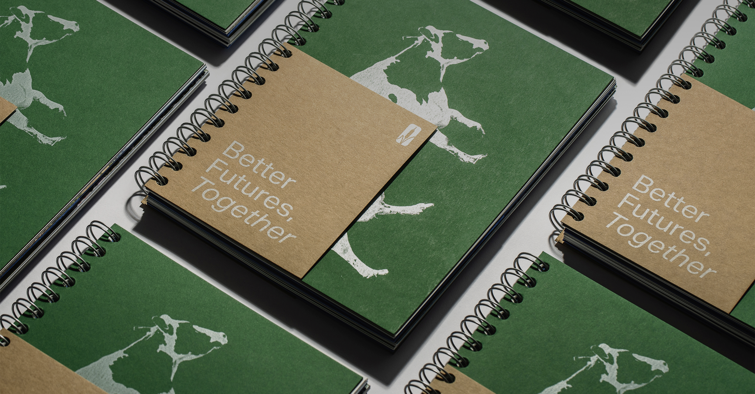
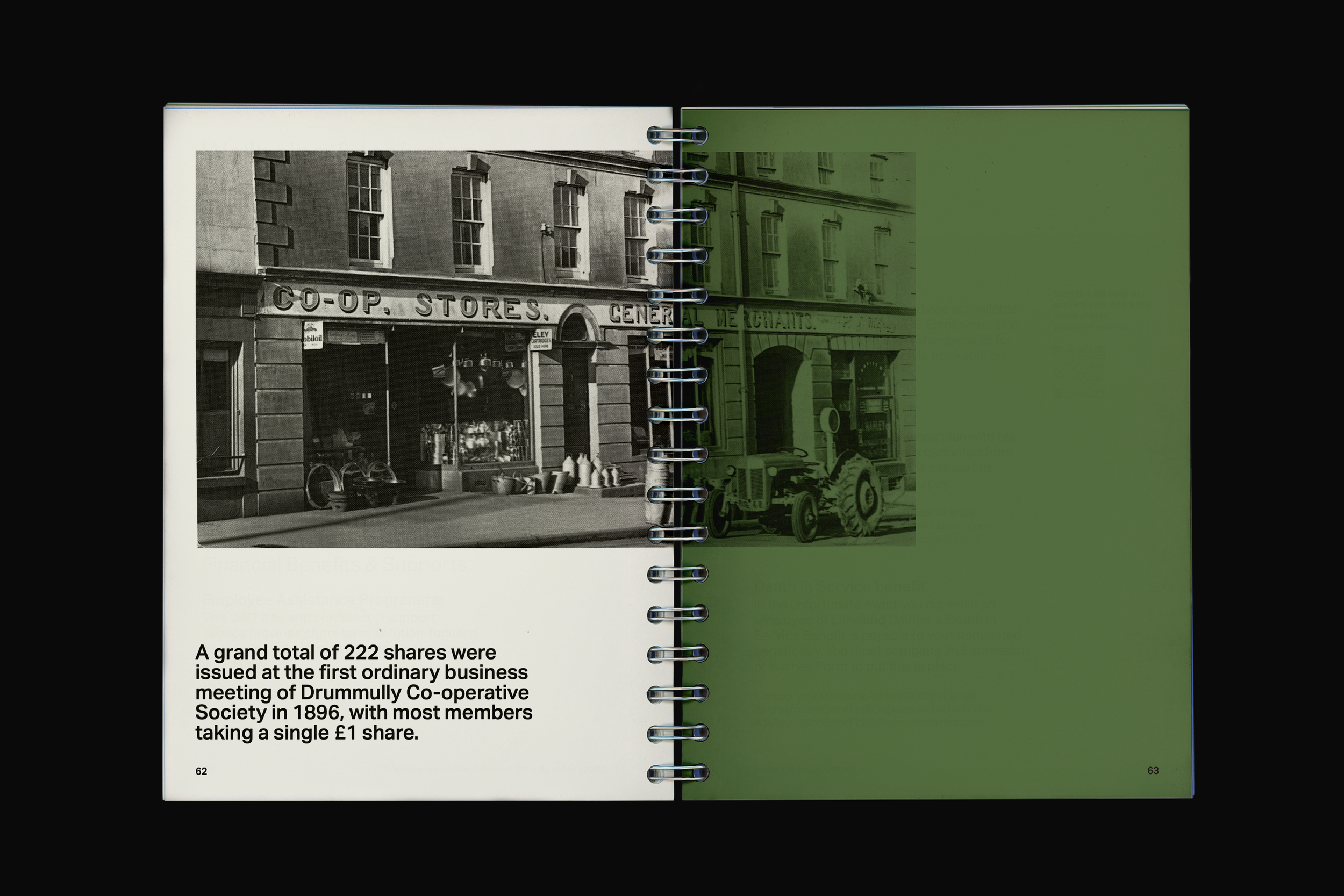
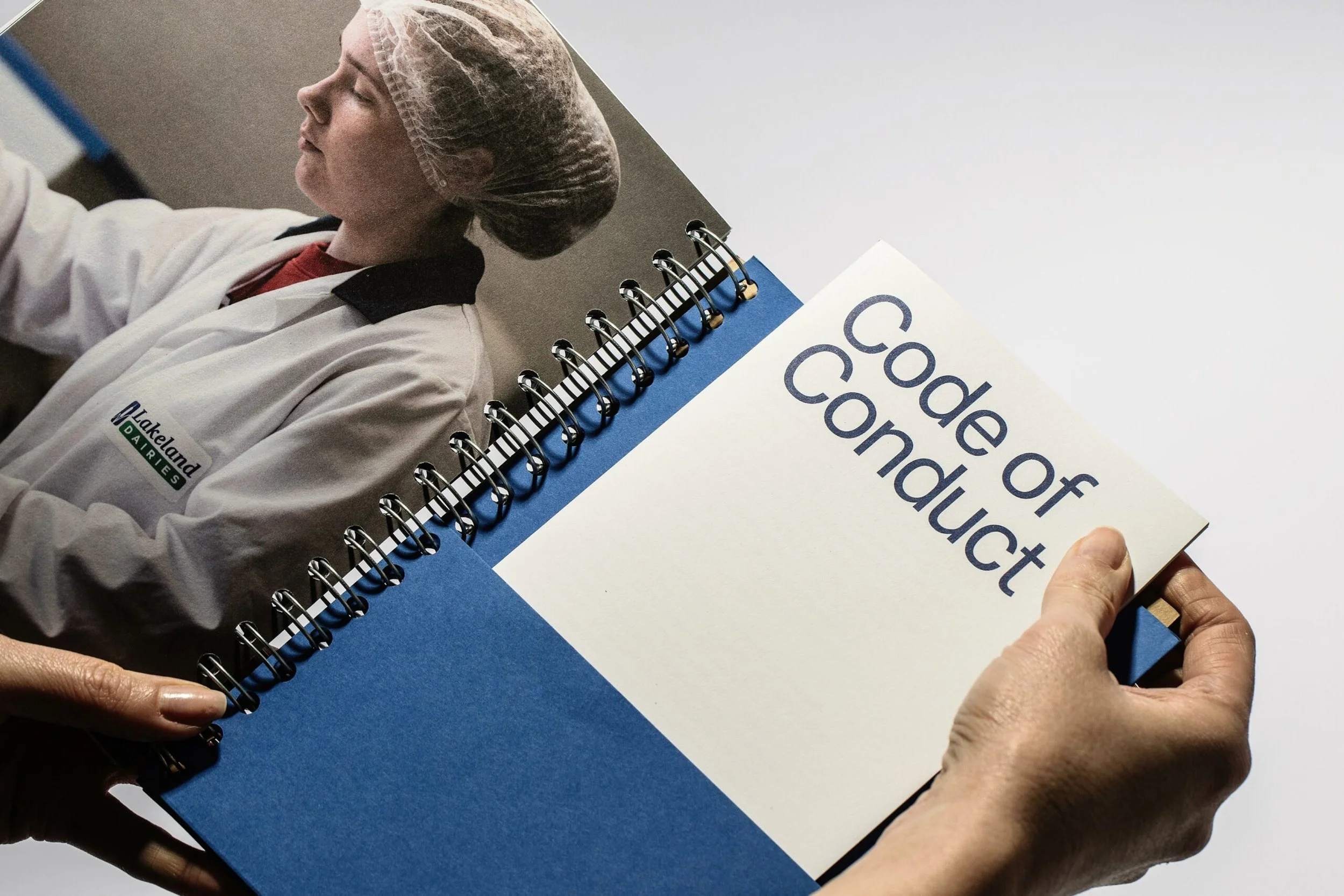
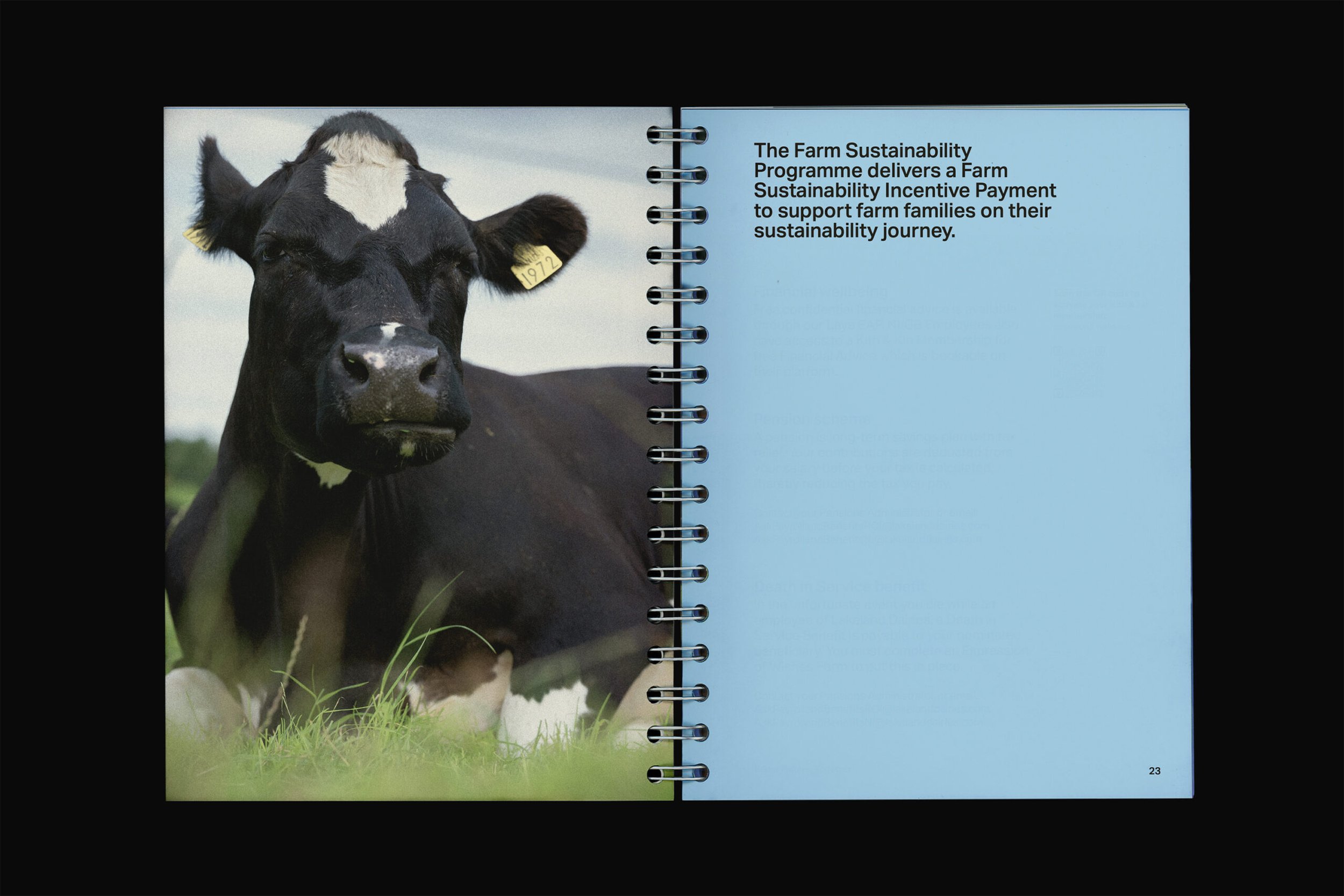
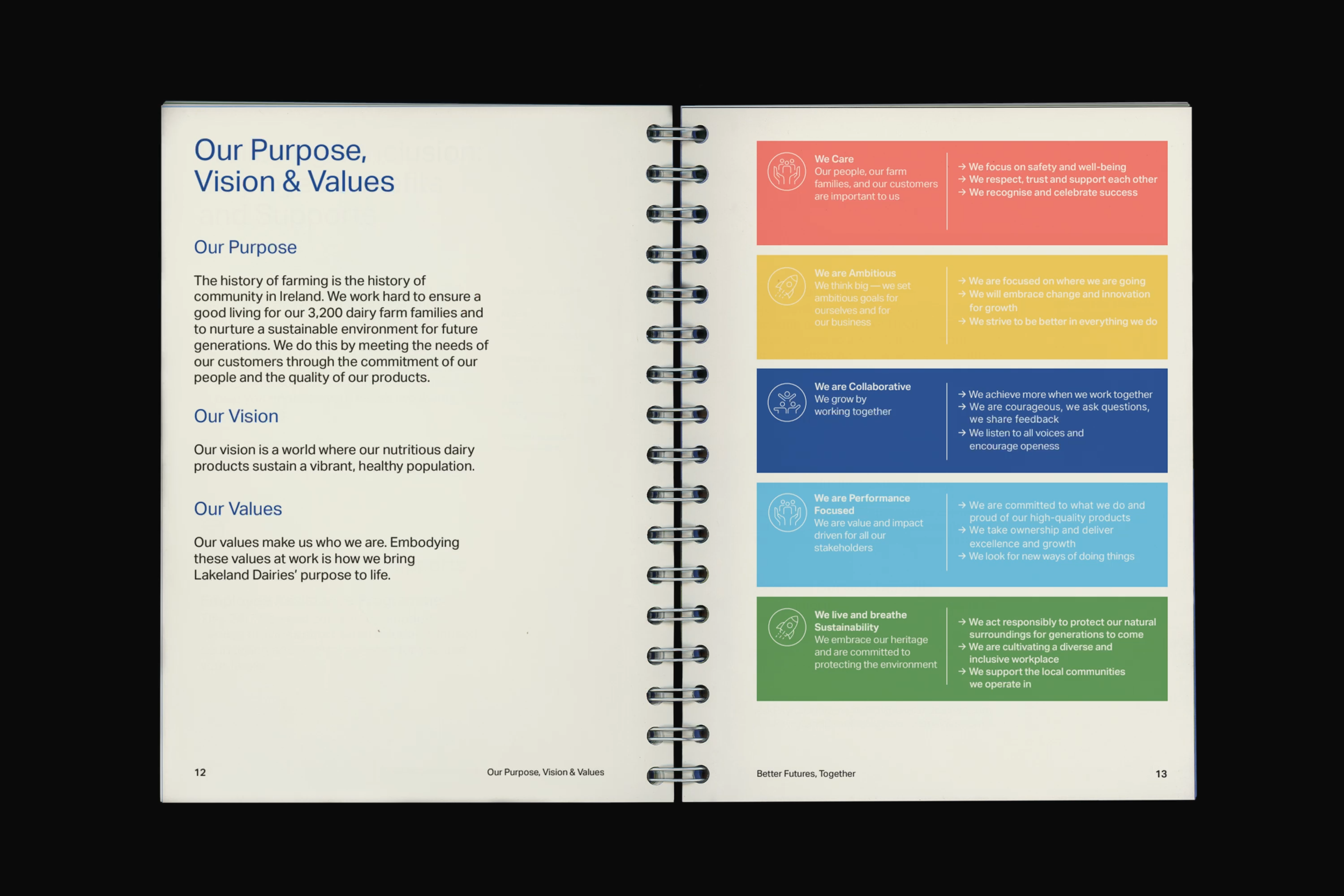
For Lakeland Dairies, they redesigned the employee handbook, turning it from a basic HR document into a keepsake-style brand object. The aim was to create something that builds pride, belonging, and shared values across the company, which is a farmer-owned co-op founded in 1897. This shifts the handbook from something purely functional into something more meaningful and engaging for employees.
The layout plays a key role in this. It is clean and well structured, using grid, spacing, and hierarchy to guide the reader through the content. This makes large amounts of information feel more manageable and less overwhelming.
The use of colour is simple but effective. Natural greens and neutral tones connect back to farming and the land, reinforcing the identity of the brand. The colour also helps separate sections clearly without distracting from the content.
This project has made me think more about how layout and colour can be used in a controlled and intentional way, especially when working with information-heavy design.